Approaches for maximizing the use of Excel with Power BI

Due to its ability to spot trends and save time, Excel is great for organizing data. It'll make it easier for you to see your data. Using a variety of graphs, charts, and illustrations, you may present your data to stakeholders and clearly convey your point of view. More current versions allow for creating data models using "M" Language and connecting to numerous data sources. Therefore, the topic of why we need Power BI might come up.


Power BI can connect to a wide range of resources, including flat files, the cloud, relational databases, NoSQL databases, data warehouses, and big data technologies. Power BI's unique structure (both a desktop application and a web service) makes it reliable, easy to use, quick, and suitable for real-time analytics. It makes advantage of the robust DAX language for it. It also functions nicely on mobile devices.

For decades, Excel has been the only tool that can be used to create spreadsheets, but it is unrivaled for all types of tabular reporting. Aside from making graphs and charts, you may perform extensive data modeling. However, its functionality ends at that point, and Power BI will now handle all upcoming tasks.

Power BI processes data more quickly than Excel because it is a tool for business intelligence (BI) and data visualization. As opposed to Excel, it can manage a lot.

Power BI dashboards have a higher level of interactivity and allow for sharing with a large number of users.

You will discover the following ways that Excel and Power BI connect through Power BI Service in this post:

Analyze in Excel:

You can connect Excel and the Power BI Service using this method. Browse the Power BI Service and choose a report, dashboard, or data set to analyze using Excel. Click the three dots to select the Analyze in Excel option. When you use Excel in this manner, a file will be created on SharePoint's backend. One more thing: the file you produced will update every time you update your data in Power BI Desktop and publish it to the Power BI Service.


Moreover, data from a graphic or tile can be exported. The format in which you choose to export your data is up to you. It's good to know that Power BI currently offers 2 options for exporting data from a visual or tile: CSV and EXCEL. Excel is only capable of storing up to 150,000 rows. The maximum number of rows that CSV can process is 30,000.


Excel can still be used to evaluate data in one more method. This method of using Excel to analyze data functions in the exact same way as the first method. To do that, select Analyze in Excel from the export menu in the top ribbon. It will launch the Excel backend provided by SharePoint, allowing you to examine your data.


Wow! Take a look at how easy it is to connect Excel to the Power BI Service. See the video below to find out more.

Connect from Excel to Power BI Service: Additionally, you can link the Power BI Dataset from Excel to the Power BI Service in order to retrieve data. To do this, click Get Data on the Data ribbon and then select Power BI from the Power Platform menu. Check out the video below. You can also upload your excel document to the Power BI Service. Your data can also be uploaded to the Power BI Service using the Excel publish method.


By using Excel's publish option, you may also upload your data to the Power BI Service. The first option is to use "Upload your workbook to Power BI," and the second is to "Export workbook data to Power BI." In order to do that, open your excel file, select the publish option from the file menu, and then select "Publish to Power BI" from the list of options.


This is how we can leverage the use of Excel & Power BI and do more impactful analysis.

PDF file link: Approaches for maximizing the use of Excel with Power BI

Health Care Analytics Case Study

Demands to cut costs, improve coordination and outcomes, deliver more with less, and be more patient-centric present challenges for healthcare organizations around the world. However, a growing body of evidence also points to the fact that ingrained inefficiencies and poor clinical outcomes are contributing to the industry's growing problems. These organizations can use "big data" to generate insightful information, establish their future direction, enhance results, and shorten time to value by developing analytics competency. In this case study, I'll discuss the issues I encountered and how I resolved them.


Project Background

Currently, healthcare encompasses more than just physicians and nurses. Healthcare includes medical facilities, medical devices, clinical trials, outsourcing, telemedicine, medical tourism, health insurance, and medical equipment. In a well-functioning hospital management workflow, many important decisions must be made, and they should be done so quickly and effectively. The most important part of our society is its healthcare system, but many medical professionals find it difficult to treat patients effectively. It is challenging to put it into practice today without a dedicated hospital management system. These changes in the healthcare industry have led to a need for a healthcare management system.

While spending literally billions of dollars more than necessary on resources that aren't being effectively utilized, healthcare organizations fall short of important objectives along the treatment continuum. By keeping an eye on them and working to improve the patient experience, these key performance indicators (KPIs) can be improved. KPIs for the healthcare industry can compile and clearly convert vital patient-related data into a dashboard. Assisting you in keeping your attention on giving care, which is where it is most required, they can make complex decisions easier.

I've included some useful KPIs below to help the healthcare organization expand more quickly:

  • Number of Patient Rooms in use at a single time: Reveals how efficiently space is used to care for patients and helps assess whether the institution needs more or less space. Take into account that this is an occupancy rate like a hotel.
  • Patient Wait Times by Process Step: The patient wait time in the hospital's emergency room is the period of time a patient must wait before receiving a diagnosis or treatment. Long wait times are perceived as a barrier to receiving care, which can be aggravating for both the institution and the patient.
  • Patient Discharge Type: This KPI will reveal the condition of the patients being discharged. For instance, do they receive their discharge at their own request or as directed by a medical practitioner?
  • Patient Recall Time: It will display how frequently a patient enters a hospital. For instance, increasing the frequency with which your patients visit you—from once a year to twice—has the same impact as doubling your gross earnings each consultation.
  • Patient Staying Information: By providing data on how long patients stay in hospitals, this metric aids in the forecasting of revenues in the medical industry. It will give an overview of the resources that are being used by the patient.
  • Type of Admissions: It will reveal the state in which a patient was admitted. For instance, if the patient is in need of treatment right away due to an emergency situation. Knowing which conditions patients are admitted for the most often would help us allocate the resources.
  • Overall Patient Satisfaction: The aspect that matters most, in the end, is patient satisfaction. The organization's services need to be extensively assessed and restarted if satisfaction is low. Happy patients are more likely to refer their care to others, which contributes to the waiting list remaining full.
  • Severity of Illness: You must be aware of their illness state in order to provide superior amenities. This will demonstrate how effectively you are offering the services. A patient had quality care if they were admitted with a minor condition and were released with a moderate condition.
  • Bed Or Room Turnover: Shows how quickly patients enter and leave the hospital. The effectiveness of the institution is impacted while evaluating patient satisfaction. You might want to closely correlate this one to readmittance rates to make sure that no sick people are able to leave the facility.
  • Gross Profit: The gross profit will demonstrate whether we going to make a profit or not. This data will help us to create our business plan. It also enables hospitals to make improvements in areas that are hurting their bottom line.


In addition to the KPIs described above, I make sure that my report includes more critical metrics to help the business decision-making process go smoothly. For instance, if you want to accelerate the expansion of your company, as an administrator, you must offer more facilities based on gender. How is that even possible? If you know how many patients are admitted based on their gender, this will undoubtedly aid you in making the best choice. Regarding the same business objective, I have created a different KPI where I want the organization to decide how to handle resource-related difficulties.

Come along with me as I am going to develop the report and will make sure the KPIs are included. In the following steps, I’ll outline how I created the report.

Data Preparation:

Data is absolutely necessary for analysis. Your worst dread may come true if the data is not sufficiently clean to deal with. Unfortunately, I did not clean the datasets I utilized. The following list includes the data sources I utilized to create this case study:

Dimension data:

  • Patient Data: This is all about the patient data, which contains demographic data about patients as well as other patient-related data. Here, I’ve made a few adjustments in accordance with my needs. For instance, I combined the patient’s first and last names to create a new calculated column called Full Name because I just require the patient’s whole name.


  • City Data: This data source includes the name of the city and a predefined ID. The Healthcare dataset is where this dataset is taken from.


  • Calendar Data: This is a calculated table developed to cease the time series analysis. I took the date range from the Healthcare data, and it includes the date, week, month, quarter, and year-associated information.


  • Fact data:

    HealthCare Data:

    Administrative information is included in this dataset, including the services the patient used and related information. For instance, the length of a patient’s stay and the state in which they are admitted. I have made a number of modifications here. The majority of the data types in the column weren’t in the right format. I had to modify them to the proper format as a result. For instance, a data format with columns for Waiting Time, Cost, Available Bed, etc. Missing values and duplicate values are problems I have dealt with.


    Data Modeling:

    In this case study, I’m going to use Power BI both for data odelling and reporting. According to Microsoft, The process of analyzing and defining all the many types of data your company creates and collects, as well as the connections among those data points, is known as data odelling. Data odelling techniques produce visual representations of the data as it is used in your company, and the process itself is an effort to comprehend and specify your data needs.

    We must link the data sources in order to obtain an accurate result if we are to attain the desired outcome. I choose Start Schema after studying the facts and how they related to one another. Relational data warehouses frequently utilize star schema, an established odelling technique. This mandates that modelers categorize their model tables as either fact or dimension. Dimension tables often have fewer rows than other types of tables. Contrarily, fact tables can have a very large number of rows and can expand over time.

    The model I created using the Star Schema for the case study is shown here.


    Report Building:

    The intuitive depiction of information provided by visualization improves decision-making processes. Choice-makers can more accurately assess the overall picture and add diverse viewpoints to a crucial decision by offering a visual representation of the facts. It can aid in improving task planning and execution and helping business leaders better comprehend their data. Making better decisions more quickly is a benefit of data visualization for leaders.

    We will therefore perform the visualization during this phase. I researched the relationship and the best approach to visualize the information based on the criteria. I created a four-page report for administrative purposes that would display all KPI data and satisfy all business criteria. Below are the pages along with brief descriptions:

    Home Page:

    You can view the executive summary of a few things on this page. First things first: you will learn about patient growth year over year from the very first depiction. You can use this in your planning section. The bed capacity may then be quickly verified branch-wise. Depending on the departments you have, you can also request information on bed capacity. You can glance at the left bottom chart to learn more about the revenue. You can also view a satisfaction study and make service improvements to support the expansion of your business. Your business may be affected by the satisfaction. Therefore, this depiction can quickly and easily make someone aware of this thing. And I used Power BI to create it so that each attribute is connected to the others.


    Hospital Information Page:

    All the information needed for the hospital is on this page. Here, you can quickly examine the number of admissions based on the time period you select and a comparison to the precise preceding time period. Additionally, you can view how many were released and the revenue you earned from them. Depending on the admission type, the degree of the disease, or the available bed, you can plan your resources. For instance, if I select Baltimore City and the time frame of 10/12/2019 to 10/03/2021, I can see that almost 9k patients used the hospital's services. We can conclude that in Baltimore City, patients in moderately bad health had to undergo trauma-type hospitalization in order to receive medical care from a department that mostly treated gynaecologists.


    Patient Information Page:

    You must understand what your patients desire if you want your business to grow. This page provides you with the patient-related information you require for professional purposes. You can find out how frequently a patient has used your services. Additionally, you can learn what they thought of the healthcare services they received. You can use the Patient Staying Information visualization to guide your judgments regarding patient stay information. According to the patient page, about 14k patients visited the Southern branch hospital between January 16, 2020, and November 11, 2020. The hospital department's average wait time was 3.38 minutes, which explains why most customers weren't happy with the services they received. Nearly 46k people have visited the facility over the time period given. Most of the patients are men, ranging in age from 51 to 60. The majority of them chose deferred discharge.


    Attention Required Page:

    Making the most important business decisions with the knowledge of overall satisfaction will be aided by this website. Not only that, but you may compare your revenue to the target amount. Patient Information Page, the portion before this one, showed patient satisfaction. The levels of satisfaction for the Neutral, Good, and Excellent kinds are carefully examined in this section. This will assist you in making decisions and give you a more thorough grasp of contentment. You may also see where the vast bulk of patients are coming from. Additionally helpful is the average wait time each department. The blow-up image reveals that the majority of the patients are from Baltimore City and that they are dissatisfied with the hospital's level of treatment. When it comes to satisfaction, they are largely in a neutral position. The organization's overall revenue is $1.6 billion, compared to their goal of $2.3 billion.


    Conclusion:

    In this case study, we focus mostly on making sure the KPI is present because that will ultimately help the decision-maker make the right choice. Power BI was mostly used in this case study to utilize the workload. Adopting new tools like Power BI has become urgently necessary due to the growing amount of data. Users may construct customized dashboards that mix on-premises and cloud-born data in a one view, allowing them to monitor their most important data enterprise wide and from all of their business apps. Dashboards, reports, and datasets form the core of Power BI. In conclusion, I have made sure that the important KPIs will accelerate corporate growth by assisting in decision-making.

    PDF file link: Health Care Analytics Case Study

    Power BI Dashboards

    If you read my essay on Power BI visualization charts, I believe you realize the importance and applicability of visuals. Now you may generate reports using those charts, which will help the decision-maker make a decision. Apparently, Microsoft "A Power BI dashboard is a single page, often known as a canvas, that uses visualizations to convey a story. A well-designed dashboard presents only the highlights of that story because it can only fit on one page. For more information, readers can view connected reports."

    I'll provide a resource file that contains a summary of all the information you need to know about Power BI dashboards in this blog series.

    PDF link: Power BI Dashboards

    Power BI Visualization Charts

    Data is present everywhere. But until you see them clearly, it won't provide you any new insights. For instance, as a decision maker at your year-end business meeting, you must make some business decisions based on the sales data from the current year. Yet, your colleagues are presenting the data as follows:

    January 2022: $2,355,222
    February 2022: $1,552,425
    March 2022: $222,656
    April 2022: $100,789
    May 2022: $200,356
    June 2022: $600,888
    July 2022: $800,566
    August 2022: $1,956,222
    September 2022: 2,787,566
    October 2022: $ 2,922,222
    November 2022: 3,555,888
    December 2022: 3,888,777


    It would be difficult for you to determine which month you sold the most products at first glance. Maybe, you have to read it twice or thrice, which will evntually squander your important time.

    What can instantly make you grasp the data?

    The visualization starts there to serve that purpose.

    I've included a PDF file link that will assist you in deciding how best to present your data, so that it is immediately understandable to everyone.

    File Link: Power BI Visualization Charts

    The Road to Power BI Datamart from Data


    Data is all around us. Do you know how much data we currently have?

    90% of the data in existence now was produced in the previous two years. Additionally, the amount of data generated globally doubles in size every two years. For a variety of connected reasons over the past 20 years, the amount of data on the planet has significantly increased. To illustrate the amount of data, the illustration is shown below.
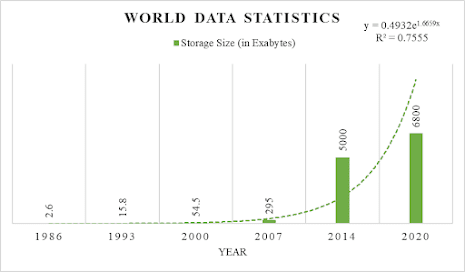

    Figure: World Data Statistics (Source)


    According to IDC, the overall global datasphere reached 175 zettabytes (175000 Exabytes) in 2025.

    As a result, we now know how much data we have. The topic of why data is present everywhere and why it is necessary may have touched our minds.

    Let's say you launched a company that produces just mobile phones. You first create 100 phones every month and sell them to a single customer. As the days pass and you continue to build your client's trust, they now request 500 phones every week. Another 20 clients, for instance, request 10,000 phones each week. Hence, 42,000 phones monthly in total. 100 people have already been hired by you to work for you. Let's assume that you can choose a phone without relying on information regarding the product. Okay, so you have 200 clients at the end of the year, and they require 1,00,000 mobile phones per week, or 4,00,000 each month. Additionally, some of the clients require additional electronics like monitors. These figures rise each year.

    So, the question is: how can you stay informed on your company's development, revenue, production data, marketing data, sales data, etc.? What's more, how can one make wise business decisions?

    The solution is that you must keep your data and utilize it to enhance your decisions. As a result, the amount of data being collected by businesses and their users is growing quickly.

    We can now see why the amount of data is growing. And there is no question why data storage is necessary.

    Let's imagine you started storing your data in local databases, cloud storage, and other places in the second year of your business and you are succeeding. Your IT department indicated that they are unable to handle the storage of data in databases after two years. The collected data will be enormous in scope as your organization develops and produces 10M+ products annually. Since databases are very simple tools, their sole purpose is to reliably and effectively store data, occasionally quite huge amounts of it. Architectural trade-offs are frequently necessary to preserve this basic capability, but they might restrict an organization's ability to access, use, and analyze its own data. Your data sources are dispersed as you have to store data in various ways. Your business analytics teams are thus having difficulty making decisions.

    Therefore, you need to come up with a better way to keep your business expanding while also making decisions about it quickly.

    In order to address these issues, you set up a data warehouse (such as Google Big Query, Snowflake, Azure Synapse, etc).

    Figure: Implementation of Data Warehouse

    Now your business may store and access structured data in the most accurate and dependable way possible with your data warehouse, which enhances cross-organizational data access via reports, dashboards, and analytics tools. Because you are confident in the reliability of the data, these enable businesses to better monitor performance and enhance decision-making.

    After a few years, as your business continued to thrive, you opened a few departments, including those for finance, marketing, production, and sales. Huge amounts of data are being generated each day.

    As days go on, you & your team find out issues that you & your teams are facing:

    ·         Accessing departmental data is becoming more complex and time-consuming which causes problems in making effective business decisions.

    ·         Facing difficulties while analyzing product sales deals on a daily basis, and the same things goes on for making sales predictions on weekly basis.

    ·         Your marketing team has to wait to get the desired data for making campaigns as at the time your sales team is also accessing the warehouse that was built.

    ·         Your data warehouse is becoming obsolete as days go on due to a hung chunk of data imported constantly.

    ·         You have to spend a lot of money to maintain the warehouse along with a lot of pressure is imposed on your IT team.

    ·         As your warehouse is containing some sensitive information, so you limited access to some people which is why gaining access is taking time.

    So, you discuss those with some experts about those problems and you come up with some solutions:

    You have to enhance the user’s response time due to the reduction in the volume of data and provide easy access to frequently requested data. For that, you have to partition your departmental data by allowing granular access control privileges.

    Which describes the features of Datamart. As Data mart is a subset of a data warehouse oriented to a particular business subject line. The data mart contains a repository of summarized data collected for analysis for specific sections or units within organizations. It is controlled by only a single department in an organization. Data Mart usually draws data from only a few sources compared to Data Warehouse. Data Mart is small in size and is more flexible compared to Data Warehouse.

    Figure: Data Mart

    If you use Data Mart technology, all of your issues will be resolved. The difficulty is, how can you accomplish it while spending as little money as possible and still offering all the amenities that a data mart typically offers?

    The following information about Data Mart implementation is what you have learned.

    ·         You'll require extra IT personnel to oversee your Data Mart.

    ·         The creation of a Data Mart takes less time than the creation of a Data Warehouse. However, how many days? Ok, after gathering information, you now know that the installation procedure takes a few months to finish.

    ·         In addition, creating a Data Mart on-site or in the cloud requires a significant financial investment.

    ·         You must teach non-technical staff members how to use a data warehouse or data mart.

    These are the main problems with the deployment of Data Mart. You have to think again about how to resolve those issues.

    Stop worrying right now. Microsoft has the answer to your issue. On May 24, 2022, Microsoft made a service with the name Power BI Datamart public. Power BI Datamart will handle every task for you. The data mart won't even need to be implemented by you because Microsoft will do it for you.

    Microsoft claims that it is a fully managed, self-service data analytics solution with a low-code, no-code user interface that will close the gap between business users and the IT department. Additionally, it has the following advantages:

    ·         Without the assistance of a database administrator, self-service users can easily do relational database analytics.

    ·         Datamarts offer end-to-end SQL data ingestion, preparation, and exploration, including no-code experiences.

    ·         Make it possible to create semantic models and reports using a single integrated experience.

    You might have been concerned about what else it might suggest. Microsoft also has a response for that. It has the following features, among others:

    ü  100% web-based, no other software required

    ü  A no-code experience resulting in a fully managed datamart

    ü  Automated performance tuning

    ü  Built-in visual and SQL Query editor for ad-hoc analysis

    ü  Support for SQL and other popular client tools

    ü  Native integration with Power BI, Microsoft Office, and other Microsoft analytics offerings

    You are probably pleased that Microsoft was able to resolve your problems. Costing information is one of the difficulties that are still outstanding.

    You also don't need to be concerned about that. since it has included Power BI Premium Per User and Premium Capabilities. Therefore, all you need to use is a Power BI Premium license. You must pay $20 per month for Power BI Premium Per User (PPU) and $4995 per month for Power BI Premium Per Capacity (PPC).

    Bang! Microsoft is going to take care of all of your issues. Continue to expand your business.


    Powered by Blogger.

    Text Widget

    Approaches for maximizing the use of Excel with Power BI

    Due to its ability to spot trends and save time, Excel is great for organizing data. It'll make it easier for you to see your data. Usin...

    Search This Blog

    Blogger Pages

    Facebook

    Popular